Because the subject of these photos is vertical, it works better in a portrait composition. There is too much space either side of the sign post in the landscape photo.
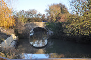
The landscape compeosition shows more of the bridge, but the portrait one shows more of the overall scene.
Landscape works better here, as it shows more of the overall scene.
The portrait composition here allows the eye to follow the path of the stream and makes it more of a focal point.
Landscape works better here as the river is the focal point.
Landscape provides more interest as it shows more of the reflected trees, in the images above and below,
Landscape makes a more interesting composition as it gives some context to the sign in the images above, and to the boat in the images below.
Portrait works better above, as it makes the pipe the focal point and allows the eye to follow it more easily.
Landscape is better for this scene, as more can be seen rather than just pavement.
Portrait is better here as more of the scene can be seen in the images above and below.
Both the above images work well, they ar both framed. However, portrait is neater.
The images above are both quite abstract, so the portrait and landscape compositions both work well.
Here the bridge scene is best suited to landscape as it adds more context.


No comments:
Post a Comment