Thursday 3 November 2011

Assignment 3

This assignment requires a variety of subjects, so I will be using a combination of still life and landscape images.  Below are the photos I have chosen for Assignment 3.

Colour Harmony through Complimentary Colours

Red and Green:  I created this still life arrangement using jelly babies and white paper for the background.  Because it is a close-up image of the sweets, they are difficult to identify as they are out of context.  However they do demonstrate the relationship of the colours well.

Blue and Orange: for this image I have created a still life using Smarties.  I used sweets for my still life photos because they have very strong colours and can be easily arranged for pleasing and interesting compositions.

Red and Green: here I have found red and green in a natural setting.  This is one of my favourite photographs as I love the movement in the poppies.  I took the image from a lowdown viewpoint to create interest.

Violet and Yellow:  I chose a flower for this combination as it seemed an obvious choice.  I could have used sweets in a still life arrangement again, but I was keen to have variety in this assignment.

Colour Harmony through Similar Colours

Blue and Green: this is a scene in the north-west of Ireland.  The beautiful colours of the sea and grass demonstrated colour harmony of similar colours very well.

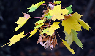
Yellow and Green: by doing this assignment in autumn, the leaves were a natural inspiration for this choice of colour.

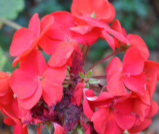
Red and Orange: again, by working on this assignment in autumn this colour combination has been in plentiful supply!

Blue and Violet: the colours in this photo are quite subtle, but I think it demonstrates well how these cool colours work together.

Colour Contrast through Contrasting Colours

Red and Yellow: I came upon this image by chance.  With friends in France we found the maize and snapped in half - I was so taken by the colours and pattern I had to photograph it.

Violet and Green: for this combination I chose to use a still life.  Again I used Smarties as the colour combination was easy to find.  I chose to arrange this in this way as I liked the symmetry and close-up view of the sweets.

Blue and Red: I particularly liked the strong contrasting colours in this photo.

Orange and Green: as I mentioned earlier, taking these photos in autumn mean greens, oranges and yellows have been very easy to find in the trees.

Colour Accent using any of the above

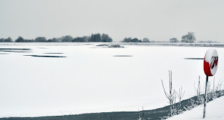
Blue and Red: this is one of my favourite photographs, the bleak white/blue of nature in contrast with the tiny area of red on the rubber ring.

Green and Orange: again autumn provided me with an ideal subject for this assignment.  As well as the small element of orange I like the softness of the shapes of the leaves in this photo.

Orange and Green:  I particularly likes the small but distinct blobs of yellow on this leaf.  I also like the detail that I captured in the leaf.

Blue and Orange: there was a small orange sweet in the pack of Smarties so I decided to make use of this for this still life arrangement.


Tuesday 25 October 2011

Exercise: Colours into tones in black and white

This exercise required me to take one image and apply four different black and white filters.  Below are the results.
Firstly, this is the image in colour.


This is the image in black and white with no filters


This is the image with a Red filter

Yellow Filter

Green Filter

Blue Filter


Colour - Exercise: Colour Relationships

For the first part of this exercise I needed to take the following colours:
Red: green 1:1
Orange: blue 1:2
Yellow: violet 1:3

These are my attempts at this.

Red: green - 1:1
These are fairly easy colours to find in nature and 50/50 is a simple ratio to apply.

Orange:blue - 1:2
Not such an easy colour relationship to find in nature, so I have improvised!
By setting up a still life composition it made it easier to set the correct ratio.

Yellow: violet - 1:3
Fortunately I had some pansies in my garden with flowers of these colours.  Here I have cropped the photo to achieve the correct ratio.

For the second part of this exercise I have chosen some images with colour combinations that appeal to me...]


This image appealed to me because of the three primary colours: green, yellow and red.  The pattern of the maize adds to the effect created by the strong colours.

This image appealed to me because of the strong contrast between the bright blue and dark red, almost brown colour in the background.  These colours clash with each other and there is an imbalance as such, but this really draws your eye to the paper (man-made flower) and how that conflicts with the natural tree branch and wood.

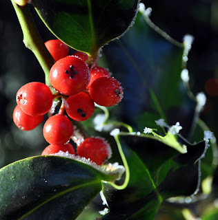
This is a classic combination of green and red which appeals to me because of the strong contrasts.  The redness of the berries is enhanced by the dark green leaves in the background.

Colour - Exercise 1

For this exercise I had to find colours to match the primary and secondary colours in the colour wheel, and then take photos using the preset exposure and then one stop below and above this.  Below are the results.

Red:
Preset Exposure

One Stop Above

One Stop Under

In this example the stop above is the most realistic and also shows the most details.  This was taken on a very bright day which I think is the reason why the preset option is less realistic and clear.

Violet:
Preset

One stop above

One stop under

The preset default version is the most realistic in for this colour, with the others looking under and over exposed respectively.

Blue:
I found blue to be a very difficult colour to find in nature (with the exception of the sky) so I had to use a man- made object for this example.
Preset

One stop under

One stop over
There is little difference between the colours in these examples, quite possibly because there is little variation in the light and it is a man-made item.

Green:
Preset

One stop above

One stop under
The default setting is the most realistic, however the stop above is not too under exposed.  However a stop under the default is over exposed.

Yellow:
Preset

One stop above

One stop under
As with previous colours, the preset is the most realistic and the next are under and over exposed respectively.

Orange:
Preset

One stop above

One stop under
 As before, the different stop settings have made the image under and over exposed respectively.


Sunday 24 April 2011

Assignment 2 (Part 2)

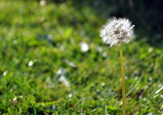
To finish this assignment I needed to take photos with a single and two point focus in the composition.  For this I used dandelions on the lawn.

Single point dominating composition
Here I used depth of field to exclude the background and emphasis the single point of focus, making the flower head and stem dominate the composition.

Two points
This image has two points at either side of the composition.

Distinct shape - circle
Whilst taking these photos I experimented with an up close photograph of the flower head and was very pleased with the result.  This is a definite circle shape and as such will also be submitting it in my assignment.

Sunday 17 April 2011

Assignment 2 (Part 1)

I have chosen flowers and plants as my subject for this assignment.  So far I have selected the following photos, and below are explanations for my choice.

Pattern
I chose this photo to represent pattern as the lavender flowers are planted in straight lines which make a pattern that goes on well beyond the composition.

Implied Triangle
The shape of this bunch of snowdrops in an inverted triangle.

Distinct Shape:
I have chosen this image because it is a very distinct circle.

Vertical Lines:
These un-open crocus provide attractive vertical lines which form the main part of this composition.

Vertical Lines:
These new buds on a weeping willow tree hang vertically and make a very pleasing photograph against the dark background.

Diagonals:
Here this formal flower bed has been planted in straight lines.  I photographed from an angle to show the right angle of the corner and form diagonal lines.

Inverted Triangles:
Here the flower beds have been planted into two triangles.  The higher one has the apex at the top and the lower the apex is at the bottom.

Rhythm:
Here the tulips have been planted very close together and combined with the light shining through the petals and leaves they have formed a rhythm across the image.  There is a certain amount of regularity but because the subject is natural it is not perfect as you would find in a man-made subject.

Curves:
For this image I took a close up photo of an orchid.  There are some very distinct curves in the flower and by taking the photo face on and cropping the edges it has made them the main focus.

Outstanding images to follow:
  • Single point dominating the composition
  • Two points
  • Several points in a deliberate shape
  • Perhaps another implied triangle